
theme:klassplace:userguide:section6
Table des matières

Klassplace: A flat design theme
Colours menu
Scss additions
- Initial raw SCSS: To define your scss variables
- Raw SCSS: to enter your scss overrides
Main colours:
- Main colour and opposite of the main colour: This is the main colour of your graphic charter. The opposite colour manages the background/text contrast.
- Alternative colour and opposite alternative colour: This is the secondary colour of your graphic charter. The opposite colour manages the background/text contrast.
- Success, warning, danger, info colours: To define colours different from those of boost for the standard Moodle messages.
- Body background colour: Main background colour of all Moodle pages.
- Navigation bar background colour: navigation bar at the top of the page.
- Navigation bar text colour: Text colour of the navigation bar at the top of the page.
- Breadcrumb background colour and breadcrumb text colour: Colour of the breadcrumb trail and its text.
- Side drawer background colour: left sandwich menu.
- Footer background colour

Front page panels:
Social icons panel
- Background colour of the social icons bar: hexadecimal value
- Choice of social networks: URL of your networks
- Possibility to add social networks and links of your choice
- Optional addition of a phone number and text of your choice


Announcements panel
- Background colour of the announcements panel: hexadecimal value
- Buttons: optional, up to two, with the text and link of your choice


Academic panel
- Background colour of the academic panel: hexadecimal value
- Image: Choose an image of your choice
- Headings: Title, subtitle and baseline
- List items: text of your choice, with or without hyperlink
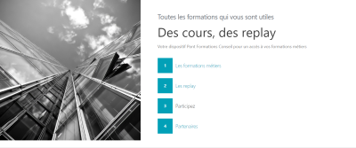

Custom content boxes panel
- Background colour of the custom content box
- Text content and icons of your choice, note: no URL links

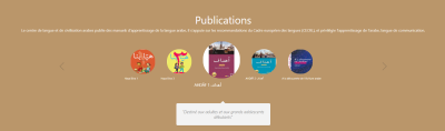
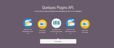
Circles panel
- Background colour of the circles panel: hexadecimal value
- Illustration of your choice
- URL on images
- Text content with headings of your choice
Events panel
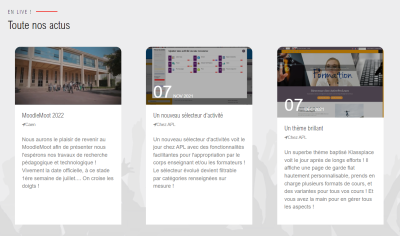
To display events or highlight elements of your platform with
- Choice of the general background illustration
- baseline and heading
- Choice for each event: optional date, place, price, link, illustration, content
- Background colour of the indicators panel
Missing image
Background colour of the image bar
Missing image
Other components
Appearance of course elements if the “course elements” plugin is installed.
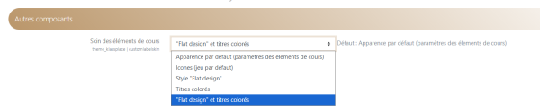
Icons
- Monochrome: If the box is checked, all activity and resource icons will be displayed in the main colour of the theme.



- Sepia filter value: Adjusts the rate at which the sepia filter is applied to all images classified “brandprimary-filter”. These images are PNG or JPG images used when the open source Fontawesome version does not provide a suitable icon. Image masks MUST be in greyscale on a transparent background. “Flat” icons must use a white mask on a transparent background so that colourisation can have an effect.
- Hue filter value: Adjust the hue filter between 0 and 360 (degrees). Values evolve as in colour pickers from red (0deg and 360deg), passing through yellow (60deg), green (120deg), cyan (180%), blue (240deg) and magenta (300deg).
- Luminance filter value: * Adjust the luminance filter between 0 and 100 (%)
- Saturate filter value: Saturation filter value in %
Credits
- Valéry Frémaux (valery@activeprolearn.com) - Code development and optimisation
- Florence Labord (florence@activeprolearn.com): Documentation and functional qualification
User guide index - Theme index - Back to plugins index - Back to the catalogue index
theme/klassplace/userguide/section6.txt · Dernière modification : de 127.0.0.1