Table des matières

Klassplace: A flat design theme: Front page
About front page sections or panels
This menu lets you adjust the settings of the theme's front page panels, each setting being organised by panel or “section”.
warning: this is not about the standard Moodle front page
Access: site admin/appearance/themes/Klassplace/front page
The choice of whether or not to display each section or panel and the display order are specified here: Choice of sections to display
Slider panel
This panel or section displays a slideshow of 1 to 6 images of your choice. The carousel height is adjustable: 175 pixels, 200 pixels, 225 pixels etc. up to 600 pixels high.
–>You will therefore choose your illustrations carefully, according to the desired height, and preferably images optimised for weight, which is good practice in Moodle administration.
Each illustration optionally has:
- Title
- URL link for each image
- Header (which is a subtitle)
Example of rendering

Social networks panel
This panel spreads across the width of the page. It displays the social icons and the contact phone number on a horizontal bar of the colour of your choice.
- For each link to a social network: FB, Twitter, Google+, Pinterest, Instagram, Youtube, Flickr, Whatsapp, Skype, Linked'in
- Display: Yes or No for each social link
- URL: Web address of the social network
- Contact: A phone number
Example of rendering

Welcome panel
This panel spreads across the width of the page. It presents the following elements:
- Title,
- Hook,
- Texts and URL links of one or two buttons, of your choice.
Example of rendering

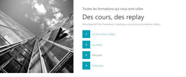
Academic panel
This panel or section presents
- Three lines of text,
- A square image, for example 800px by 800px, displayed on the left,
- And up to six items to enter a text with a link.
Lines of text:
- Hook on line 1
- Header on line 2, this is the main title
- Description on line 3
For the 6 items:
- Welcome item x: text of your choice
- Item link x: URL link of your choice
- Display condition: See Display engine
Example of rendering
Custom content boxes
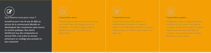
This section lets you present 4 to 8 marketing spots. These boxes have no links, they are made for small editorial content.
- Box title: Title of the spot
- Icon: fa icon called - Example: fa-square - If this element is not filled in, the icon will not appear
- Description: editorial text of your choice
- Display condition: See Display engine
Example of rendering
Note that the background colour of each area changes when the mouse passes over the area, as in the screenshot below on thumbnail 1.
Events panel
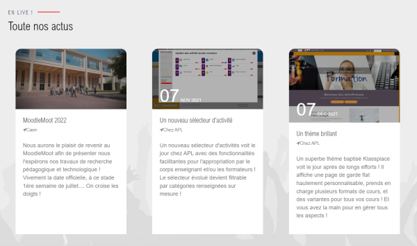
Panel
- Hook: Hook for the panel
- Title: Title of the panel
- Default event image: Image for all events, if a custom image is not dragged for each individual event.
For each event
- Show event x: Yes/no
- Event image x: Drag an illustration, the optimal size is 375px × 330px
- Day: optional
- Month and year: Optional
- Title: Event title
- URL: link of your choice
- Place: Optional
- Description: Text content
- Map: Optional, example: “See on the map”
- Map URL: Link to the map (google map or other)
- Price x: optional, if paid event
- Direct purchase URL x: If you have the Moodle online shop by APL - Optional
- Display condition: See Display engine
Example of rendering
Indicators panel
Indicators are statistical graphs issued by certain plugins compatible with the indicators panel of the Klassplace theme
- tagline: Hook
- Header: Title of the panel
- Description
- Image
For each indicator
- Title x: Title of the indicator
- Graph index x: Index of the graph in the results of a plugin that provides statistical indicators. Some plugins implement the provision of statistical indicators. (E.g.: block_course_notification:1). Refer to the documentation of these plugins.
- Value override x: Default: 98. If this value is set, then an alternative graph with this fixed value is displayed.
- Alternative URL x: If this value is set, then the image pointed to by the URL will be displayed instead of the graph
- Display condition: See Display engine
Circles panel
This panel displays images or illustrations, directory-style, in up to 9 circles, with:
- Background image, title and hook text
- Then for each circle to display: image, text, URL, role or other text of your choice, score, comment that appears in a comic-style bubble.
Example of rendering
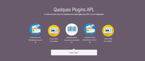
Image bar panel
This panel displays logos of clients, partners, pedagogy illustrations, whatever you want in fact. From 1 to 9 images.
For each image
- Image: 200px by 200px
- URL: link on the image
- Display condition: See Display engine
Example of rendering

Front page colours
Addition of a colour selector for the following front page sections:
- Contact navigation bar.
- Announcement section.
- Customisable boxes section.
- Client logos section.
Credits
- Valéry Frémaux (valery@activeprolearn.com)- Code development and optimisation
- Florence Labord (florence@activeprolearn.com) : Documentation and functional qualification
Theme index - User guide index - Back to plugins index - Back to the catalogue index